How Interior Designers Plan a Cohesive Cabinetry and Door Theme Throughout a Home
The objective is to design your interiors in a way that every element is in sync. And it should reflect in your home that is envisioned not bought randomly.
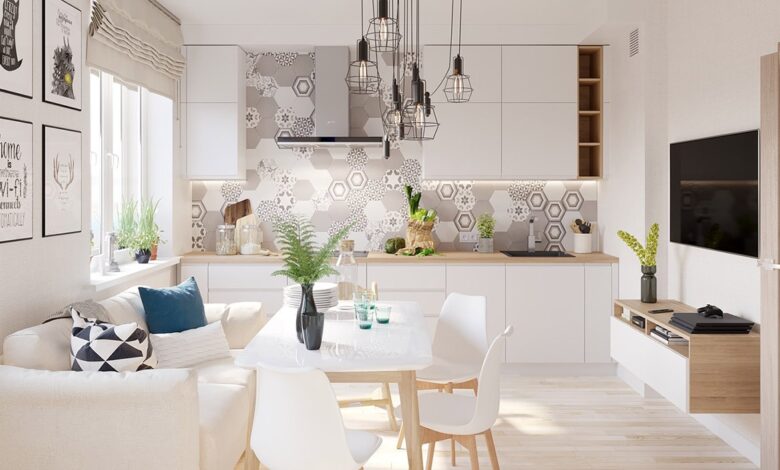
When designers chat about a balanced cabinetry and door theme, they don’t resort to purchasing a similar finish and applying it uniformly. It’s about creating an architectural vocabulary by using a series of recurring visual hints to render a home seem purposive, constantly from the foyer to the sleeping sanctuary. The assets, silhouettes, and finishes employed for MDF doors and cabinets are at the core of the process, and the strategy beneath it is more organized than you might visualize.
Start With the Passage Door Profile, Not the Cabinets
Most people think that a home’s cabinetry informs the architecture of its interior. Most designers actually approach it the other way around.
The primary passage door is the first thing you see when you walk into a room. It sets the architectural tone before you’ve even looked at the cabinetry. So the logical starting point is selecting that door profile, whether it’s a clean three-panel shaker, a simple slab, or something with more detail like a craftsman-style sticking, and then working backward to derive the cabinet door profiles from it.
If the passage doors are shaker style with a particular stile-and-rail proportion, the cabinet doors in that home should echo those proportions. Not duplicate them exactly, that would look mechanical, but reflect them. A passage door with a relatively narrow stile-and-rail frame reads as modern and restrained. Cabinet doors in the same home should carry that same visual weight, even if the actual dimensions are different because they’re scaled to smaller drawers and cabinet fronts.
This is where a lot of DIY renovations fall apart. Someone picks cabinetry they love, then buys passage doors separately, and the two things never quite feel like they belong in the same building. Starting with a profile family and scaling it consistently is how you avoid that.
Why MDF is the Standard Material For This Approach
Solid wood is a good option for certain applications. But when it comes to painted doors and cabinets, it really isn’t the best choice, and this isn’t an argument based on cost, it’s an argument based on performance.
Wood contracts and expands. This happens as a result of changes in humidity and temperature. Eventually, this movement appears as hairline cracks in the paint on joints. In a home where a painted finish is in place, those cracks can be seen and are difficult to fix without leaving a mark. MDF doesn’t have any of that.
MDF does not have grain, and is not subjected to the same thermal expansion issues. That is why it is the industry standard substrate in absolutely any home where a painted finish is specified. When sourcing components for this kind of scheme, working with a manufacturer like Lovech ensures that both interior passage doors and custom cabinetry come from the same CNC routing and surface preparation process, which is the only reliable way to guarantee that the profiles, edge details, and paint-ready finish quality are truly consistent across both product types.
Another reason why MDF is a go-to solution for painted finish doors and cabinets is the fact that the surface is genuinely different from wood. It takes paint without the wood grain carving itself in. When a sprayed lacquer finish is applied in the factory, the result is an even, flat, flawless surface.
This consistency is key when unifying passage doors with cabinetry across dozens of rooms. If texture varies between pieces (routed MDF and 100% MDF, vs solid wood pieces) you can notice the difference and cohesion is gone.
Proportional Scaling Between Doors and Cabinets
A profile that looks elegant on a full-height passage door won’t automatically translate to a small cabinet drawer front. The proportions have to be rebalanced.
Consider a shaker door with a 3.5-inch stile width. On an 8-foot passage door, that reads as refined and well-proportioned. Put that same 3.5-inch stile on a 12-inch drawer front and the frame is almost wider than the panel. It looks heavy and clunky. Designers reduce the stile width proportionally, often down to 2 inches or even slightly less for small drawers, so the visual ratio between frame and panel stays consistent even as the overall piece gets smaller.
The same logic applies to edge profiles. If the passage door casing has a subtle bevelled edge, the cabinet doors should carry the same bevel language, scaled to fit. Square edges throughout, rounded throughout, or bevelled throughout, the profile vocabulary should stay consistent. Mixing square-edged cabinets with bullnose casing on the doors creates a subtle visual friction that people notice even if they can’t articulate why.
This is also where the trim and baseboard profiles come in. Casing and baseboard are often treated as an afterthought, but they’re part of the same architectural conversation. A home with flat, square-edged casing and then ornate, curved cabinet door profiles will feel mismatched in a way that’s difficult to fix after the fact.
Designing Around Sightlines
Sightlines refer to the view you have from one room to another. Far more critical than most imagine when it comes to the overall aesthetic of your home.
For example, standing in a living room and looking into an open kitchen you see cabinet door faces and the edge of the passage door to the hallway. If those two elements have different profile languages, different edge treatments, or especially different finishes, they compete. The eye gets pulled in two directions. When they share a profile family and a color relationship, the space feels continuous and resolved.
Our brains have limits with what they can process visually. For all the dozens of components that make up your construct, you’re capable of actually processing three or four things at a time. The same is true when you look at the component parts of someone else’s design and ask yourself why it works or doesn’t. Odds are that it comes down to sightlines and the priorities of a given designer.
The 60-30-10 Rule For Color Across Rooms
Making everything the same color is one of the most paralyzing mistakes in home design. It removes depth, it makes a home feel flat, and it almost always makes the cabinetry read as lost against the walls instead of anchoring the room.
The 60-30-10 framework is a useful tool for designing something that doesn’t exist yet, you’re framing a starting point to begin to make decisions like what the doors and cabinets should be painted. Sixty percent of the visual field is the dominant color, walls, trim, ceilings. Thirty percent is the secondary color, this is usually where cabinetry and passage doors live. Ten percent is accent, hardware, fixtures, accessories.
Applied to a whole-home millwork scheme, this means the doors and cabinets don’t have to be the same color to feel like they belong together. An off-white trim color used on passage doors through most of the house, with a deeper navy or sage green on kitchen cabinets, still reads as a unified color scheme because the two colors are in a clear relationship. The ten percent, a consistent hardware finish in satin brass or matte black across both the passage doors and the cabinet pulls, is what ties the whole thing together visually.
The hardware finish is so incredibly underrated as a unifying tool. A single consistent metal finish used on passage door hardware, cabinet pulls, and hinges creates a visual thread that runs through the entire home. It doesn’t require you to match every hinge plate, just hit the highlights repeatedly.
Managing the Transition From Public to Private Zones
Not every room in a home needs the same level of detail. The entry hall, living room, and kitchen carry the most design weight because they’re where guests spend their time and where sightlines are most active. Bedrooms, laundry rooms, and storage areas can be simplified without breaking cohesion.
The way to handle this transition is to maintain the color family and the edge-profile vocabulary while reducing the complexity of the profile itself. A home with detailed shaker-style millwork in the main living areas might shift to a simpler flat-panel door in the guest bedroom, but if that flat-panel door uses the same paint color and the same hardware finish, it still reads as part of the same design language. It’s a quieter version of the same conversation.
This also keeps costs manageable on larger projects. Concentrating the detailed, more expensive profiles in high-visibility areas while simplifying elsewhere is a standard practice, it’s not a compromise, it’s good allocation.
Factory Finishes and Why They Matter For Cohesion
Paint applied on site is inconsistent. It’s a different thickness, sheen, and texture based on who is applying it, the current weather, and how the material underneath was prepped. If you’re hoping everything from passage doors to cabinetry across different rooms will look like they share the same finish, that site-applied paint is not going to get you there.
A flowed coat of sprayed lacquer on MDF from the manufacturer, though? Application is controlled. Coating thickness is pretty even. Sheen level is the same on every part that came off the assembly line. So when that passage door and cabinet door show up to your house from the same manufacturer with the same factory finish, they really do look like they came from the same house. They did, in the meaningful way.
Picking factory finishes is also better and easier for service and maintenance. If you have a matching finish code, then in a decade, you can still order a part and not have a single stranger in your home witness any swatches.
The coordinated home doesn’t just occur. It’s the outcome of starting from a strong profile language, knowing how MDF works best with a painted finish, sizing and scaling proportions properly, and being thoughtful about color and hardware and finish at every component level. That’s the difference between a house that matches and a house that’s just right.


